Table of Contents
How it all began
I started my adventure with wearables when a Xiaomi Mi Band 4 appeared on the market and wore it for nearly four years since its release. It had pretty much everything I was looking for: a small form factor for my wrist and a long battery life that lasted up to 20 days with no visible bugs and glitches.
When the updates came out, the Band 5 and Band 6 honestly looked like downgrades so I never considered upgrading anytime soon. To elaborate, the battery life on those was a week shorter even though the SpO2 was a good addition, it was still not worth switching in my opinion.
Personal values
For me, the number one priority is, and always will be, the battery life of the device, and a close second is taken by the device’s size. The wearable should be unnoticeable, when you move or when you sleep as I see it as an entry to cybernetic life. It should be an extension of your arm and your life because it’s that useful.
Let’s take a standard watch for example, all it actually does is show us the time of day which is great and also needed, but in no way accommodates our further needs in life as human beings. That being said, we have these awesome little bands, that allow us to gather data on our health condition throughout the year and observe its dynamics. You can look back a year or two and see how your heart has performed before, compared to how it does currently which is vital knowledge that something is amiss and we can take action before it’s too late.
Comparison with other bands
With my search for the next upgrade, I’ve considered these bands under $100:
- Xiaomi Mi Band 7 Pro
- Xiaomi Mi Band 7
- HUAWEI Band 7
- Amazfit GTR 2
- Amazfit Band 7
This is where I figured that Amazfit used pretty much the same app and account as the Xiaomi bands so I looked at Amazfit GTR 2 closer and was blown away by all the features it provides for just under $100. A 3GB mp3 storage, GPS, huge battery capacity with 14 days rated, and apps support. Although it is a bit bulky to my taste as it had a round display that limits you as the developer in the way it shows the data on the screen. You always need to keep the corners that are located in the abstract coordinates and not at relative zero which adds to the complexity of app development. But that wasn’t a deal breaker for me and I thought, “Yes, this is it“, the time to press the “Buy” button is NOW!
Unfortunately, that wasn’t the case. As soon as I started reading reviews about it, everybody in the universe complained about its exceptionally poor sensor performance. The GPS precision could vary up to half a mile, the sleep data was absolute nonsense, and the heart rate was the number generator. Which I later figured out, doesn’t even support mini app development. This suddenly opened my eyes to why this watch goes with a 50% discount right after a year of its release. Later I figured out that it didn’t support 3-rd party app development either, and I was led by a misleading post found on the internet.
And that is how I finally ended up with my actual pick, the Amazfit Band 7. But before I go to the details of the good, the bad, and the ugly of it. I’d like to mention Xiaomi Mi Band 7 one more time. As that watch definitely takes the second spot for me personally after going through the whole list and re-evaluating. A couple of things that helped with the decision were that both of them are running a ZeppOS 1.0 under the hood but they were branched and at this point, Xiaomi is doing their own stuff which posed some concerns regardless of the future of their Band series. And with the released Mi Band 8, I think those concerns were confirmed. It felt like a downgrade yet again. You can develop apps on it, but they needed to be built into the watch face. Which is just a no-go direction.
Albeit, if you don’t mind rounder corners the Mi Band 7 might be a very good pick for you. Especially with its vibrant display with higher pixel density.
Amazfit Band 7 review
Let’s walk from ugly and bad toward what I really liked about this band.
When I received the band there was already one thing I didn’t like – the packaging box. It’s built in a way that you need to tear it apart to get to the actual device. This means if you ever plan to resell or gift it, the box will be noticeably damaged but with that being said, it was possible for me to open it more or less accurately using a paper knife and doing cuts at the top and the bottom part. Either way, this packaging has its benefits that ensure that the device wasn’t tampered with, is genuine, and received right from the manufacturer.
The strap has this matte feel and I don’t see any visible wear on its holes where the locking pin goes after about 4 months of its use. This was quite a big issue on Mi Band 4 straps which usually caused them to fall apart and be torn from the hole toward the strap’s edges. At best the holes were getting loose which essentially makes you use those that aren’t designed for your wrist making it tighter or loose.
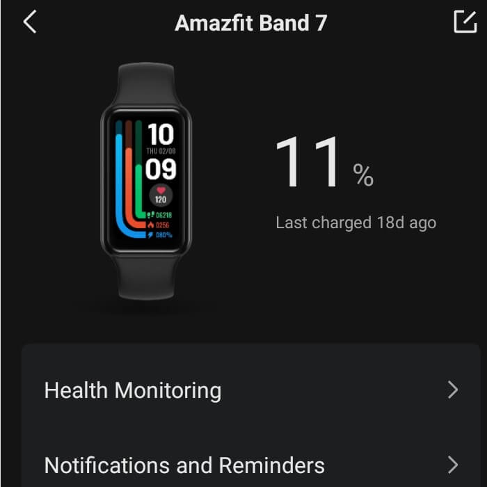
The next thing on my testing list was the part that means the most to me – the battery life. Amazfit Band 7 has a rated 18 days, but throughout my testing, it lasted only around 10-12 days which was far from my expectations. Disabling some additional features that I use didn’t really make much of a difference either.
As I start digging further, I didn’t find anyone complaining about the short battery life when this band was initially released. So my assumption was, the problem might be in the software. That maybe one of the recent updates brought something that draws too much unnecessary background power from it so I instantly suspected Alexa‘s integration, which I’ve previously played with but didn’t find useful.
It heavily relies on your band having a godlike Bluetooth connection and most importantly speeds with your phone. Having one of the Xiaomi budget devices was a huge issue as their Bluetooth module shares the same antenna with the WiFi module, which introduces interference between those two and drastically handicaps their speeds. The use of 5G WiFi helps but that’s a different story.
So the goal was clear, we need to roll back the firmware. I can’t get into the details of how it was done, but I can confirm that it’s possible. This is where I should put a disclaimer that I’m in no way encouraging anyone to do that. There’s no official way, and it always has the possibility to render the device dead and put it out of service for good, so this has to be kept in mind.
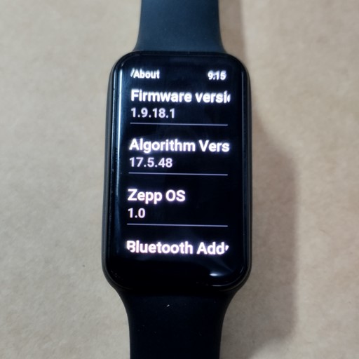
Originally I was on the firmware version 1.10.85.1 and rolled back to the very first official non-beta release which was 1.9.18.1.

Upon measuring my battery life, went from draining about 10% a day to around 5%. Which has increased its overall productivity to 20 days and that was it, the band officially earned a golden status for me. Also, the 20 days mean from 100% to 0%, so technically it’s 18 days as was originally advertised as well as, when the battery charge falls below 10% the Zepp app changes the %batt text to the one that encourages you to put it on the charger, so you theoretically won’t see any number past 18 days.

The settings I use and the way I do it
You might think that I sacrificed a lot of features to achieve the 20 days battery life but that is in no way true. I use all of those I find useful and here’s the list with a detailed explanation of how and why I use them below.
Health Monitoring
- Auto heart rate monitor: 10 minutes
- High heart rate alert: OFF
- Low heart rate alert: OFF
- Active heart rate monitor: ON
- Assisted sleep monitoring: ON
- Sleep breathing quality monitoring: OFF
- Auto stress Monitor: OFF
- Auto Blood O2 monitor: ON
- Low blood oxygen alert: OFF
Band Settings Display and Brightness
- Brightness level: 0 (zero)
- Screen-on duration: 10 sec.
- Always On display: OFF
- Lift wrist to view info: OFF
- Screen On upon notification: ON
- Vibration: ON (custom, shortest)
- DND: ON (on for 10 hours)
Additional Settings
- Discoverable: OFF
- Activity heart rate sharing: OFF
- Unlock screen: ON
Now let’s dive into each setting. I kept the heart rate measurement at 10 minutes which you might find on the lower side but I found this to be the best value per buck or in our case per battery percent %. Keeping 1 min intervals yields more precision but on a bigger scale doesn’t add much. When we zoom out on the chart and look at the hourly or daily, the data will be averaged anyway. Plus, with an Active heart rate monitor enabled, the band already switches to the constant measurement so having it at 1 minute or one hour becomes meaningless. The point is when you exercise, the data gathered will be precise.
*That said if you have some rare condition with irregular heart rate spikes, you might benefit from having it at 1 min.
I find having the High/Low heart rate & Low SpO2 alerts pointless unless you have a supervisor that sits next to you. When you exercise you will have an elevated heart rate, and once it drops below a certain value, you probably wouldn’t want to know that because the next thing you’ll get is a panic attack that won’t help in any way.
The same goes for the Stress Monitor. When I’m stressed, I’m stressed, no need to remind me. And the whole formula behind its calculation is far from what it should be. It takes into account your hear-rate, but if you have an irregular heart rate (meaning it changes often through the day or even minutes), it will indicate that you are pretty much under stress all the time. Which is far from being the truth.
Now to the settings. I keep the brightness at level 0 which I probably should call 1. The very minimum. I find it already lit enough for my environment, but that’s of course a personal preference and depends if you use the band often outside.
Sleep breathing quality monitoring has no use for the majority unless you are under a medical condition. You can turn it on, use it for a couple of days, check the data, and then turn it off and forget. The battery investment into this feature is not worth it.
Always On Display (AOD), I don’t find useful. Unless you want to impress people around you or look at the time very often, this in my opinion not worth the ~50% battery trade-off. But again this is personal preference and there’s no right or wrong answer here.
Lift wrist to view info isn’t that bad of a feature but it executes too often when you don’t ask for it, or when you sleep. Which again, reduces the battery life for a trade-off in convenience. Of course, for some people, this feature will be a must if their other hand is busy or due to a disability.
And for additional settings. I keep discoverability and heart rate sharing, off to slightly increase the battery life. Those are definitely a must feature but it is also great that we can disable them at will.
Developing Apps
As mentioned before, the band is running a ZeppOS 1.0 under the hood. Which runs on a QuickJS engine written in plain C.
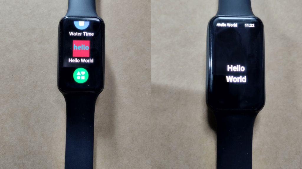
The 3rd party mini-apps we write in JavaScript with ES2020 specifications. Here’s the official Hello World example, which is pretty straightforward:
					export const { width: DEVICE_WIDTH, height: DEVICE_HEIGHT } = hmSetting.getDeviceInfo()

const TEXT_STYLE = {
  text: "Hello World",
  x: px(42),
  y: px(200),
  w: DEVICE_WIDTH - px(42) * 2,
  h: px(100),
  color: 0xffffff,
  text_size: px(36),
  align_h: hmUI.align.CENTER_H,
  text_style: hmUI.text_style.WRAP,
}

const logger = DeviceRuntimeCore.HmLogger.getLogger('helloworld')
Page({
  build() {
    logger.debug('page build invoked')
    hmUI.createWidget(hmUI.widget.TEXT, {
      ...TEXT_STYLE,
    })
  },
  onInit() {
    logger.debug('page onInit invoked')
  },

  onDestroy() {
    logger.debug('page onDestroy invoked')
  },
})
You can read more about these functions and their life cycle in the official API. Here’s how our little Hello World app looks on an actual device:

Hardware specifics
The band has an AMOLED 1.47″ inch display and 198 x 368 resolution. It is worth mentioning that by default the status bar, the one you can see at the top is taking away 28 pixels bringing the actual resolution for you to work with to 198 x 340. That said it’s possible to disable it with a simple hmUI.setStatusBarVisible(false) command. But that is something you should keep in mind while developing, if the status bar is visible you need to manually provide the 28-pixel shift to every widget (text, image, etc) to be at the location you think it should be. In other words, putting your text widget with a size of 28 pixels at the location x: 0, y: 0 won’t be visible as it will be behind the status bar.
There is 128 MB of storage memory, from which about 30 MB is available to the developer. It doesn’t sound big in the world of terabytes and petabytes but in actuality is huge. The “Hello World” example takes only 6.4 KB of space. The majority of apps built for ZeppOS take about 50 to 100 KB. The games can take a couple of megabytes though, due to the fact that the images are stored in a slightly modified Targa (TGA) format, which has no compression.
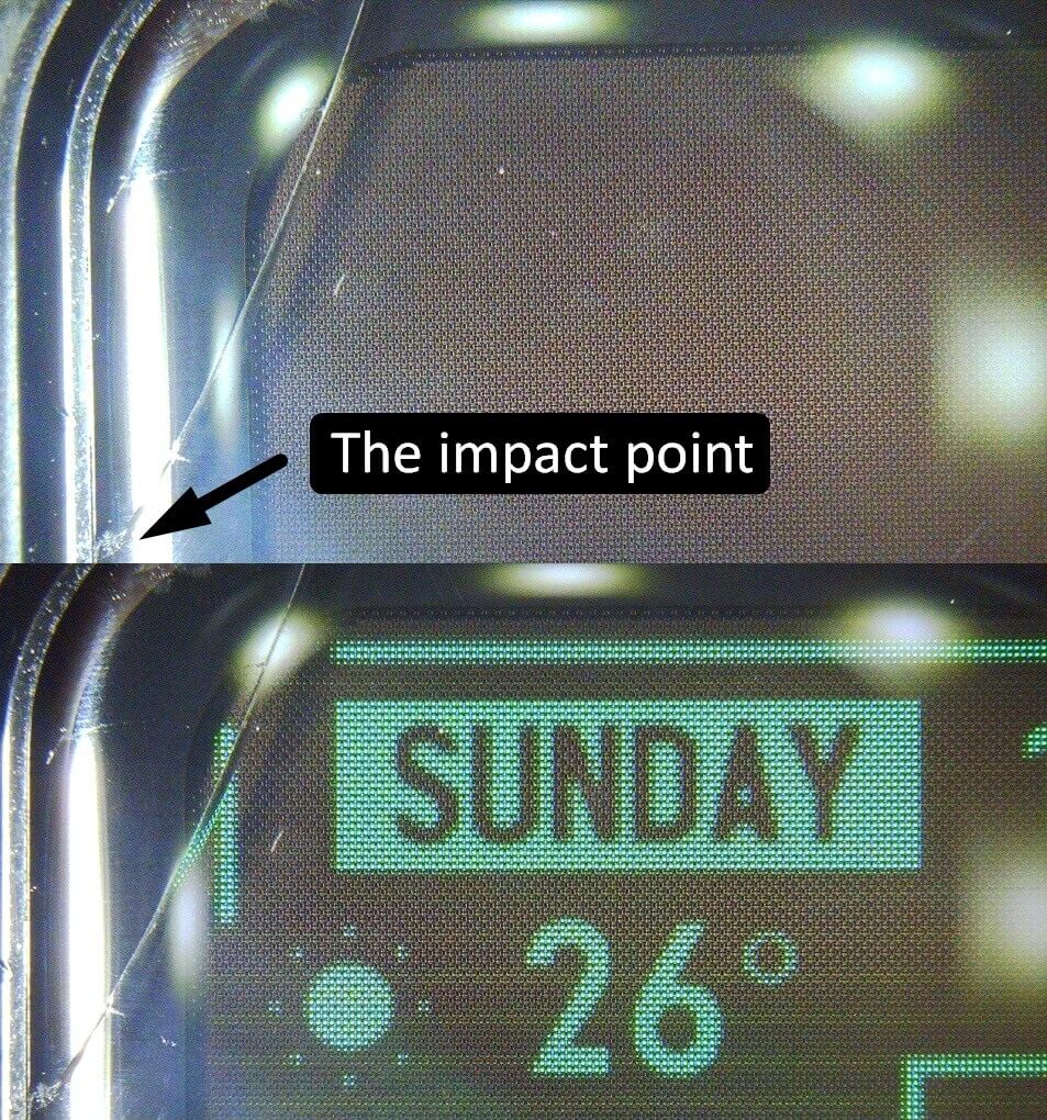
One more thing I’d like to mention is that the front glass is pretty weak, and something that needs to be addressed. I accidentally hit a door while it was opening with it, and it left a mini crack in the glass. It isn’t that noticeable unless you look under the microscope. The point of impact was pretty small but left a really long scar on the glass. This is something I have never experienced with the Mi Band 4 and I’ve been using it for years, and here I got it after the first week of using it. So be very gentle with this device. There are screen protectors on the market that you might consider.

Conclusion
The Amazfit Band 7 ended up being well worth its price tag. There is a lot to tinker with creating your own mini-apps and downloading some community-made ones.
The battery is great for the features it brings, even if you stay on the most recent firmware it’s not a huge deal.
You have access to the Side Service API which has a Server (mobile phone) and a Client (wristband) relationship. Which is missing on the Xiaomi Band 7 implementation of ZeppOS as it’s not officially supported by the Zepp app. There are workarounds though but it’s not an out-of-the-box type of solution. With this suit, your band has access to the outer world allowing you to control your home devices or check stock prices at the convenience of a little device on your hand.
The weak sides of this device are its build and the fact that it probably will never be upgraded to the most recent ZeppOS releases 2.0 and onwards. But even with that limitation, there’s a lot of stuff you can create with what the API supports now.
Interested to learn more?
Check out the docs to get you started: https://docs.zepp.com/docs/1.0/guides/quick-start/

