✨️ What does AutoGUI Solve?
Working with GUI is one if not the most tedious processes you have to go through while creating your apps for ZeppOS. Even a simple “Hello, World!” example takes a substantial amount of lines of code to produce. But it should be simple, it’s just a line of text and that is exactly where AutoGUI steps in. It handles all the math or the majority of it for you, so you can invest your time into more important things, like developing an actual app.
Let’s take a closer look at some examples to see where this library really shines. The first one we will take a look at is the mentioned “Hello, World!”.
Table of Contents
💡Example 1: Hello, World!
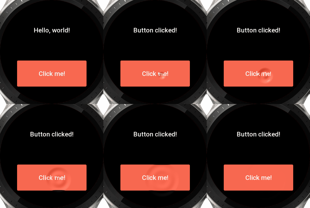
Here’s what it takes to create this example with AutoGUI:
					// install -> npm i @silver-zepp/autogui
import AutoGUI from "@silver-zepp/autogui"
const gui = new AutoGUI;

// add a text widget
const my_text = gui.text("Hello, world!");

//split the line
gui.newRow();

// add a button widget with a click event
gui.button("Click me!", () => {
    // update the text widget on button click
    my_text.update({ text: "Button clicked!" });

    // get and print text object properties
    const props =  my_text.getProperties();
    console.log(`Text: ${ props.text }
                 Height: ${ props.h }`);
});

// finally render the GUI
gui.render();
And here’s the original approach that achieves the same functionality:
					import { getDeviceInfo } from "@zos/device";
export const { width: DEVICE_WIDTH, height: DEVICE_HEIGHT } = getDeviceInfo();
import hmUI, { createWidget, widget, align, text_style, prop } from "@zos/ui";
import { px } from "@zos/utils";

// create a text widget at the top of the screen
const my_text = createWidget(widget.TEXT, {
    text: "Hello, world!",
    x: px(42),
    y: px(42),
    w: px(DEVICE_WIDTH - 42 * 2),
    h: px(100),
    color: 0xffffff,
    text_size: 36,
    align_h: hmUI.align.CENTER_H,
    text_style: hmUI.text_style.WRAP,
});

// create a button widget at the bottom of the screen
const my_button = createWidget(widget.BUTTON, {
    text: "Click me!",
    x: px(42),
    y: px(DEVICE_HEIGHT - 42 - 100),
    w: px(DEVICE_WIDTH - 42 * 2),
    h: px(100),
    normal_color: 0xffaa00,
    press_color: 0xffaa33,
    click_func: () => {
        // update the text widget on button click
        my_text.setProperty(prop.MORE, { text: "Button clicked!" });
    },
});
Pretty sizeable difference, isn’t it? The code ends up being very clean and easy on the eyes even for a person who develops for ZeppOS for the first time or sees JavaScript in general.
Now let’s take a closer look at more complex examples. This time we will skip the Apples to Oranges comparison because the number of lines in those will be ginormous.
⚡️ Quickstart
You can install the AutoGUI from the NPM registry or download it directly from GitHub.
npm i @silver-zepp/autogui
npm i @silver-zepp/autogui@legacy
					git clone
https://github.com/silver-zepp/zeppos-autogui.git
💡Example 2: Rotating Arc
					// globally increase the text size for all widgets
AutoGUI.SetTextSize(90);

// create a group that contains an arc and the text in the middle
gui.startGroup();
  this.arc = gui.arc(); // gui.arc(0, true);
  this.text = gui.text("0");
gui.endGroup();

setInterval(() => {
  temp_angle = (temp_angle + 5) % 360;

  // readjust angle based on the coordinate system
  let end_angle = temp_angle;
  if (!this.arc.use_original_coordinates) {
    end_angle -= 90;
  }

  // update the text and the arc with each tick
  this.arc.update({ end_angle: end_angle });
  this.text.update({ text: temp_angle + '°' });
}, 100);

gui.render();
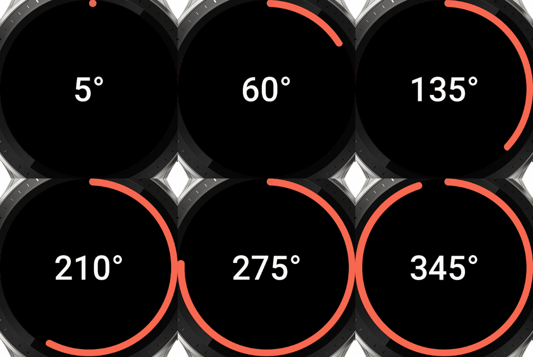
Here we introduce one additional feature that we will touch on deeper later on. There are static setters that act globally toward all the widgets on the screen and with AutoGUI.SetTextSize(90); we set the text size to be really large, taking a nice portion of the screen.
Then we just increment the angle by 5° and update the arc and the text every 0.1 seconds.
One more thing to keep in mind here, the Arc widget is shifted by -90° compared to the original approach. If you have to use the original arc that starts from +90° make sure to set a flag for that gui.arc(end_angle, true);
💡Example 3: Color Picker
					const colors_arr = [COLOR_RED, COLOR_ORANGE, ...];

// create a modifiable text field
this.txt_selected_color =
    gui.text("Selected color: #000000");

gui.newRow();

for (const color of colors_arr) {
  // create a fill rect object
  const rect = gui.fillRect(color);

  // assign "on release" actions
  rect.onRelease(() => {
    this.txt_selected_color.update({
      text: "Selected color: #" + color.toString(16)
    });
    // reset the rect color
    rect.update({ color: color });
  });

  // assign "on press" action:
  // dim the rect color by 30%
  rect.onPress(() => {
    rect.update({
        color: multiplyHexColor(color, 0.7)
    })
  });
}

gui.render();
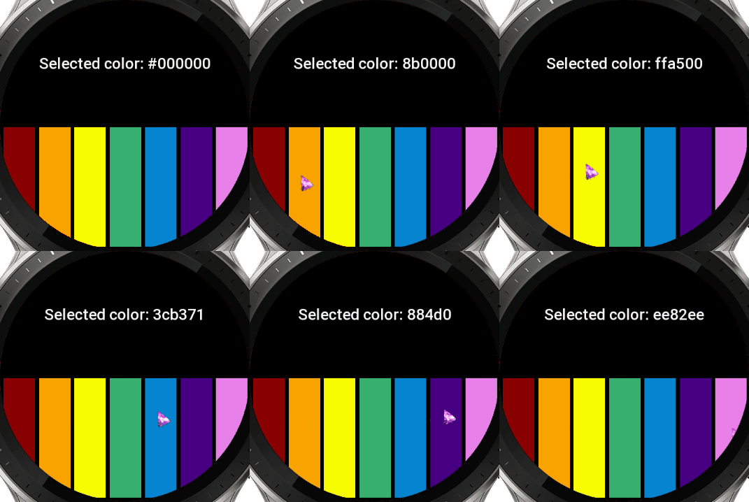
Nothing fancy here. We just create an array of colors and for each of them we create a fill rect. But here’s a special thing, we can use .onRelease() and .onPress() events and update the text field and rects as we store references to them.
Notice that we are using the multiplyHexColor(color, multiplier) function which is also a part of the AutoGUI library and allows you to easily multiply or divide the color by a multiplier. For example, when you multiply a pure red color 0xff0000 by 1.3 (30%) you will get 0xff3333 which is a lighter version of red. This way you don’t have to hardcode many colors but generate them procedurally.
💡Example 4: Calculator
					// describe calculator's layout
const btn_layout_arr = [
  "7", "8", "9", "x", "n",
  "4", "5", "6", "+", "n",
  "1", "2", "3", "-", "n",
  "<", "0", ".", "/", "n",
];

// draw the text field
this.my_text = gui.text("0");

gui.newRow();

// draw the buttons
for(let i = 0; i < btn_layout_arr.length; i++){
  if (btn_layout_arr[i] === "n"){
    gui.newRow();
  } else {
    gui.button(btn_layout_arr[i], ()=> onBtn(btn_layout_arr[i]));
  }
}

// last line/row
gui.spacer();
  gui.button("C", ()=> onBtn("C", this.my_text, sound));
  gui.button("=", ()=> onBtn("=", this.my_text, sound));
gui.spacer();

// specify layout for the buttons on the last row in %
// [ 17 ] [   33   ] [   33   ] [ 17 ]
gui.rowLayout(17, 33, 33, 17);

// finally render the whole gui
gui.render();
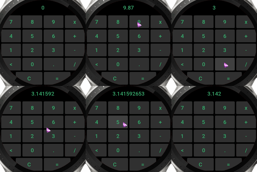
Surprisingly creating a GUI for an okay-looking calculator takes a very small amount of lines of code. We create a single text field at the top, then we create 16 buttons in the middle walking through a layout array with a for loop, and finally two more at the bottom.
If you take a closer look at the last two buttons “C” and “=” they take an uneven amount of space. That is because we are further describing the layout of the last line (row) with the .rowLayout() method, which takes percentages for each widget in the row. Here we have 4 widgets, two of them are gui.spacer()‘s and are essentially invisible. The spacers in fact don’t create any widgets, it’s simple math. So they are really performant and you can use them to split widgets and have more flexibility building your GUI. So in this case we distribute 33% of the line’s space to each button and 17% to each spacer.
💡Example 5: Nested Widgets
					// create the group
gui.startGroup();
  // store references to the required widgets
  const fill    = gui.fillRect(COLOR_RED);
  const text    = gui.text("Hello");
  const stroke  = gui.strokeRect(COLOR_BLUE);
// close the group
gui.endGroup();

// update group widget's individual elements on button clicks
gui.button("Change\nText", ()=> {
    text.update({ text: randomAnimalName() })
});

gui.newRow();

gui.button("Change\nFill", ()=> {
    fill.update({ color: randomHex() });
});
gui.button("Change\nStroke", ()=> {
    stroke.update({
        color: randomHex(),
        line_width: 16
    })
});

// render the GUI
gui.render();
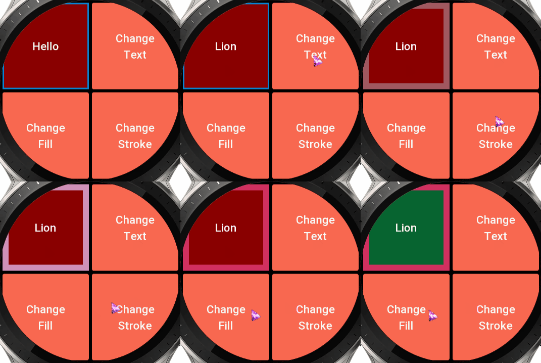
This was a suggestion from one of my colleagues and it’s a great one! We now support a one-level-deep nesting of the widgets. Allowing you to stockpile the widgets on top of each other. In this example we put 3 widgets at one spot the fill rect, the text field, and finally the stroke rect. We also store the references to each of them so we are able to update each of them individually in the future.
💡Example 6: Auto Reconstruction
					// create 9 widgets across 3 rows (rubix' cube style)
for (let i = 0; i < 3; i++) {
  for (let j = 0; j < 3; j++) {
    // create the button and set to remove itself when clicked, apply random color and text
    const btn = gui.button(
        randomAnimalName(),
        ()=> btn.remove(),
        {
            normal_color: randomHex()
        });
  }
  // don't create a new line after the last row
  if (i < 2) {
    gui.newRow();
  }
}

// render the GUI
gui.render();
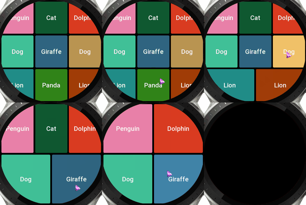
This is a very cool feature of AutoGUI. When a widget gets removed, the whole GUI auto-reconstructs itself! In this example, we initially created 9 buttons. We set a random text for the button, and for the action we specify btn.remove() which when clicked, removes itself.
Additionally, we use the last, optional, parameter of the AutoGUI widgets. Which takes an object that accepts all the default parameters from an original Widgets API. Thanks to this, we are able to assign a random color to every button.
💡Example 7: Custom Themes
					gui.text("Customized GUI Themes!");

gui.newRow(); // ---

gui.button("Text size ⬆️", ()=> {
    AutoGUI.SetTextSize(AutoGUI.GetTextSize() + 5);
    gui.render(true);
});
gui.button("Text size ⬇️", ()=> {
    AutoGUI.SetTextSize(AutoGUI.GetTextSize() - 5);
    gui.render(true);
});
gui.button("Color\nCHANGE", ()=> {
    AutoGUI.SetColor(randomHex());
    gui.render(true);
});
gui.button("Text color\nCHANGE", ()=> {
    AutoGUI.SetTextColor(randomHex());
    gui.render(true);
});

gui.newRow(); // ---

gui.button("Btn radius ⬆️", ()=> {
    AutoGUI.SetBtnRadius(AutoGUI.GetBtnRadius()+10);
    gui.render(true);
});
gui.button("Btn radius ⬇️", ()=> {
    AutoGUI.SetBtnRadius(AutoGUI.GetBtnRadius()-10);
    gui.render(true);
});

gui.newRow(); // ---

gui.button("Padding ⬆️", ()=> {
    AutoGUI.SetPadding(AutoGUI.GetPadding() + 5);
    gui.render(true);
});
gui.button("Padding ⬇️", ()=> {
    AutoGUI.SetPadding(AutoGUI.GetPadding() - 5);
    gui.render(true);
});

gui.newRow(); // ---

gui.startGroup();
  // the color of this widget won't change
  gui.fillRect(multiplyHexColor(COLOR_WHITE, 0.2));
  // while this one will, as it wasn't specified
  gui.strokeRect();
gui.endGroup();

// render the gui
gui.render();
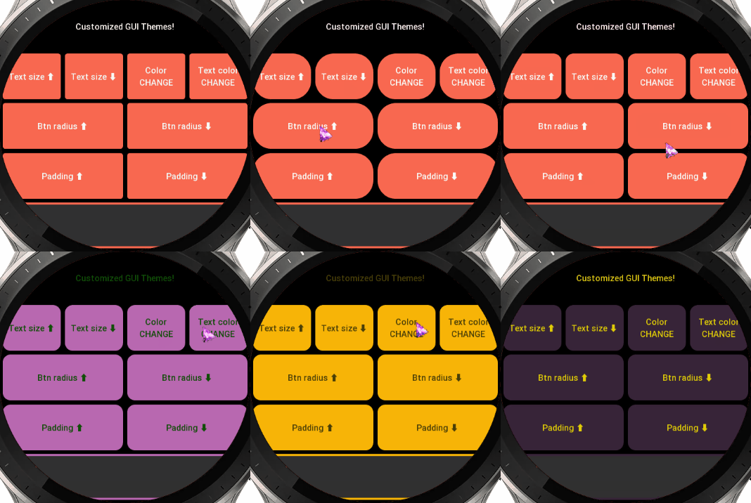
This is another big feature of AutoGUI, the major changes that we can introduce into GUI in real time!
Here we extensively use our static Setters/Getters that you access outside the instance of your class, through AutoGUI.Set… and AutoGUI.Get… to achieve this functionality. Keep in mind that the gray color of the filled rectangle at the bottom never changes, because we manually specified its color.
Using this approach you can quickly create different themes and styles for your app. White/Dark themes, etc.
💡Example 8: Advanced Rich GUI
					// create a text field group at the top
// (background image + text)
gui.startGroup();
  gui.image("/icons/text-field.png");
  const text_field = gui.text(
    "Click on one of the icons!",
    {  color: COLOR_WHITE  });
gui.endGroup();

// split the line
gui.newRow();

// describe the buttons
const buttons_arr = [
  "Medkit",
  "Gown",
  "Mask",
  "Syringe"
];

// create the button groups with each containing
// a button with an image, stroke and fill rect
// assign "on press" and "on release" events
for (let i = 0; i < buttons_arr.length; i++) {
  const button_name = buttons_arr[i];
  const text_on_press =
    `${button_name} is being pressed!`;
  const text_on_release =
    `${button_name} was released!`;
  const src =
    `icons/${button_name.toLowerCase()}-96.png`;

  gui.startGroup();

    const fill = gui.fillRect(
        multiplyHexColor(COLOR_BLUE, 0.8),
        { radius: 16 });
    gui.image(src, { auto_scale: false });
    const rect = gui.strokeRect(
        multiplyHexColor(COLOR_BLUE, 1.3),
        { line_width: 6, radius: 16 });

    // attach events to the last widget in the group
    rect.onPress(() => {
      text_field.update({ text: text_on_press });
      fill.update({ color:
        multiplyHexColor(COLOR_BLUE, 1.3) });
    });
    rect.onRelease(() => {
      text_field.update({ text: text_on_release });
      fill.update({ color:
        multiplyHexColor(COLOR_BLUE, 0.8) });
    });

  gui.endGroup();

  // add a new line after every two buttons
  if (i % 2 === 1) {
    gui.newRow();
  }
}

// render the GUI
gui.render();
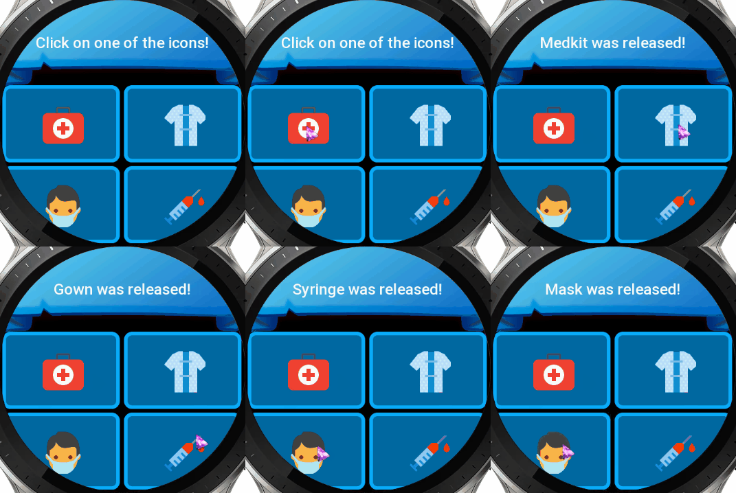
This one so far is the most comprehensive and nice-looking GUI example.
We basically use all the features combined. First, we use a background image on which we put our text field. That’s our first group. Then we go to the next line and create our four buttons. But we are not using the original buttons approach, we instead use another nested widget that consists of:
- a filled rectangle as a background
- an image
- and a stroke
We initialize them with custom parameters and finally to the last widget in the group (a stroke rect) we attach .onPress and .onRelease events. Essentially we recreate a usual button, but a better one, because this one supports both events not just onPress.
📖 Tips & Tricks
- Don’t forget to always gui.render() your GUI after you’ve described it. That’s the only way to create the actual widgets. Think of creating a GUI before the render, as of describing and creating a map of all widgets on the screen. We can’t build them one by one, because upfront, we don’t know how many widgets there are therefore their position and sizing is unknown.
- When nesting the widgets using startGroup/endGroup and attaching onPress/onRelease events to them, make sure you attach the event to the last widget in the group as the widgets overlap each other, which blocks the event interaction.
- Use multiplyHexColor(color, multiplier) function to get more shapes of color without hardcoding them.
- There are two approaches to remove a widget gui.removeWidget(my_widget) and my_widget.remove()
- my_widget.getProperties() method has 3 use cases, please see its description to learn more
📝 AutoGUI API Reference
Add a text element in GUI system.
text: The text to display.options: Optional parameters for the text.
Returns: The created widget.
Add a button in GUI system.
text: The text to display on the button.click_func: The function to execute when the button is clicked.options: Optional parameters for the button.
Returns: The created widget.
Add an image in GUI system.
src: The source URL of the image.options: Optional parameters for the image.
Returns: The created widget.
Add a circle in GUI system.
color: The color of the circle.options: Optional parameters for the circle.
Returns: The created widget.
Add an arc in GUI system.
end_angle: The end angle of the arc.use_original_coordinates: Whether to use original coordinates for the arc.options: Optional parameters for the arc.
Returns: The created widget.
Add a filled rectangle in GUI system.
color: The color of the rectangle.options: Optional parameters for the filled rectangle.
Returns: The created widget.
Add a stroked rectangle in GUI system.
color: The color of the rectangle’s stroke.options: Optional parameters for the stroked rectangle.
Returns: The created widget.
Add a new row in GUI system.
Add a spacer in GUI system.
Set layout percentages for each row in GUI system.
percentages: The layout percentages for each line in GUI system.
Multiplies/Divides each component (red, green, blue) of a hexadecimal color by a multiplier.
hex_color: The hexadecimal color to multiply.multiplier: The multiplier/divider. [example 1]: 1.3 = +30% [example 2]: 0.7 = -30%.
Returns: The resulting hexadecimal color after multiplication.
Set the padding value globally.
- value: The new padding value.
Get the current padding value.
- Returns: The current padding value.
Set the default color value globally.
- value: The new default color value.
Get the current default color value.
- Returns: The current default color value.
Set the default text color value globally.
- value: The new default text color value.
Get the current default text color value.
- Returns: The current default text color value.
Set the default text size globally.
- value: The new default text size.
Get the current default text size.
- Returns: The current default text size.
Set the default text globally.
- value: The new default text.
Get the current default text.
- Returns: The current default text.
Set the default button radius globally.
- value: The new default button radius.
Get the current button radius.
- Returns: The current button radius.

